Stanford Well-Being Rebranding Campaign
tl;dr
I conceptualized a rebranding game plan for Stanford Well-being - from its visual identity, brand tone, social media strategy, and creative direction. The campaign launched on October 5th, and you can follow the changes on the @stanfordwellbeing handle on Instagram.
THE PROBLEM
Stanford Well-being has been around for nearly 6 years. It provides helpful resources to Stanford students as it relates to mental health and well-being, but the problem is many Stanford students have no idea about it. Since email listservs are often oversaturated with more popular clubs/resource centers, the team at Stanford Well-being turned to social media to reach Stanford students and beyond. However, there wasn’t anyone on the team that was familiar with student needs and behaviors, which led to rebranding failures in the past. They were looking to create a sustainable rebrand of Stanford Well-being that engaged students in a way that also implemented a more structured social media strategy.
Task
The mission of Well-Being at Stanford is to empower individuals and communities to flourish through education, connection and positive culture change.
As the new digital media manager and creative director, I was tasked with innovating the Stanford Well-Being brand identity into something new. Over the course of three weeks, I performed competitive analysis of 17 wellness centered Instagrams (both within the higher education industry as well as outside), and conducted an audit of 29 wellness companies (from small start-ups to large institutions) to research brand tone, observe visual identity trends, understand typical work flows, and conceptualize best practices to transfer over to Stanford Well-Being.
Ultimately, I designed a rebranding kit and developed a revamped social media strategy to position Stanford Well-Being as a relevant and welcoming resource to students, both on-campus and online (paying particular attention to the context of COVID-19).
I deployed these changes on October 5th and currently design social media assets + schedule posts through a content management system. I also manage Stanford Well-Being’s weekly email campaigns.
tools + Services
Adobe Creative Suite, Copywriting, Brand Innovation, Content Design
client
Well-Being at Stanford
TIMELINE
3 weeks (but launch is ongoing)
Role
Creative Director + Brand Strategist
THE RESULTS
As of November 18, Stanford Wellbeing’s Instagram following grew 86%, and engagement with the account has increased 1850%. The launch is ongoing and the next steps following fall quarter is to revisit the initial strategy to adjust practices for Q1 2021.
Logo
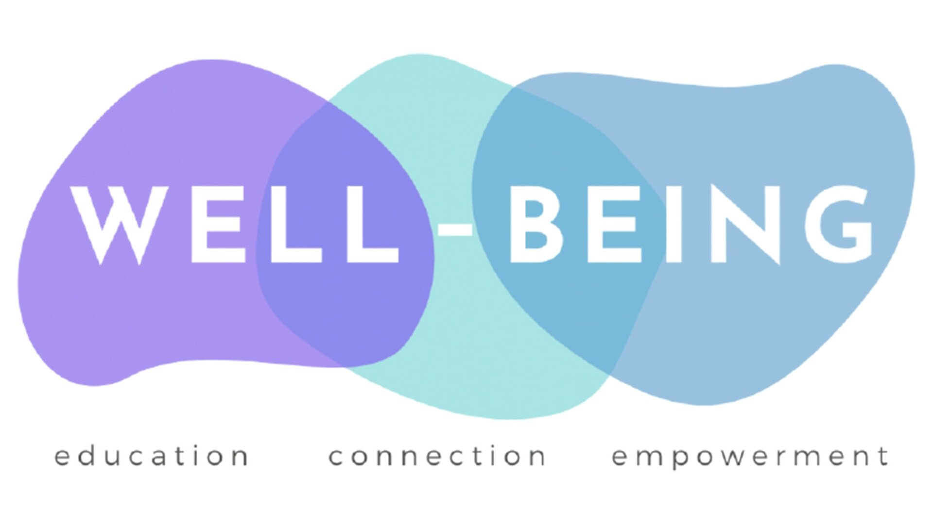
Retaining the integrity of Stanford Well-Being and incorporating a wellness motivated design (the blobs). Color scheme mirrors the cool + calming nature of the work Stanford Well-Being does. (designer: Marissa Floro, PhD)
Visual Identity

The reimagined Stanford Well-Being color palette hinges on the 3 visible colors of the logo, along with 2 additional colors that complement and round out the palette as a whole; slight variants of these colors allowed (by discretion). A mix of warm pastels and cooler tones provide flexibility in providing a visual base of specific content assets that may be shared on @stanfordwellbeing.
Typography

The thought process behind choosing a bold + structured font was motivated behind the desire to mirror a the structure of a strong and organized lifestyle of those with thriving mental health + wellness.

On the other hand, I also wanted to include a font with a more editorial looking vibe to parallel the fact that you don’t always need structure in life; you can let loose and have a little fun with it!
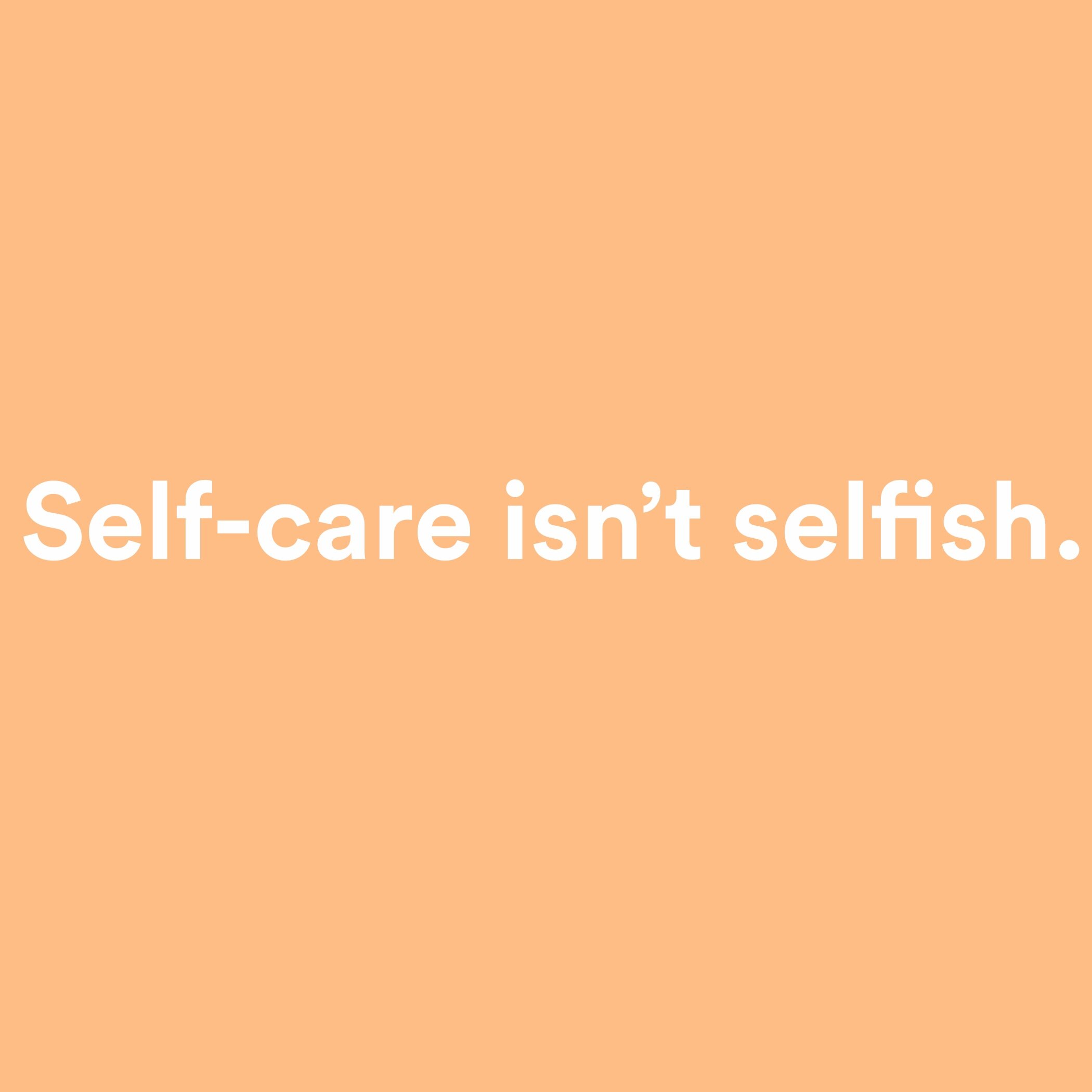
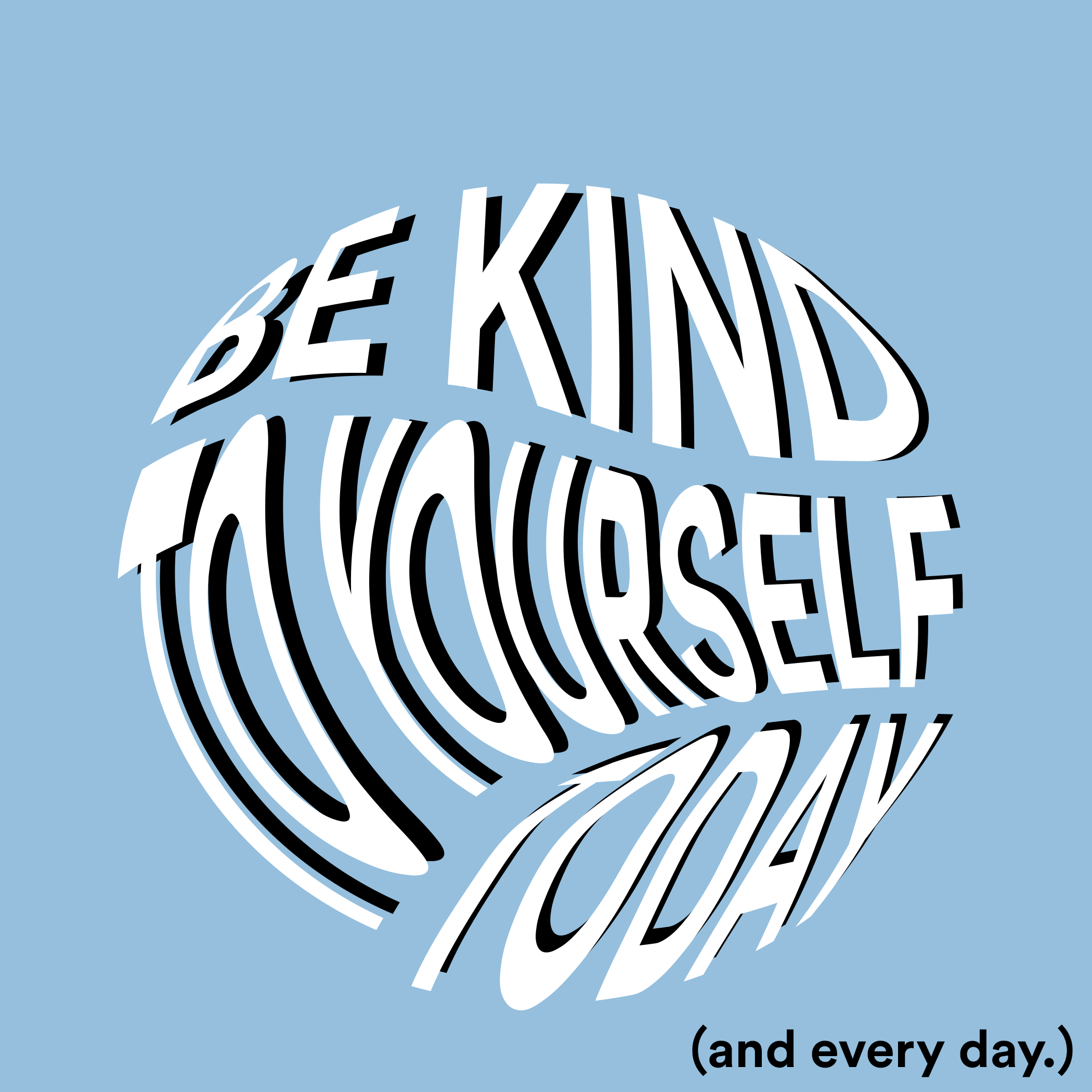
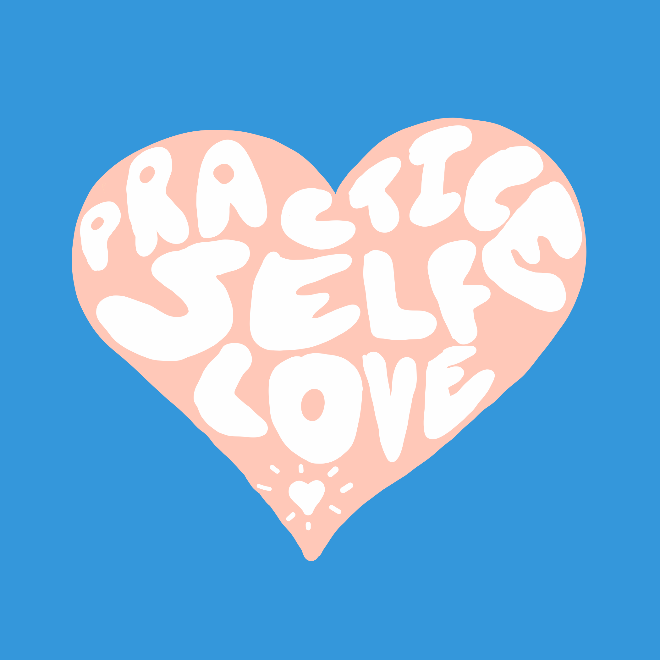
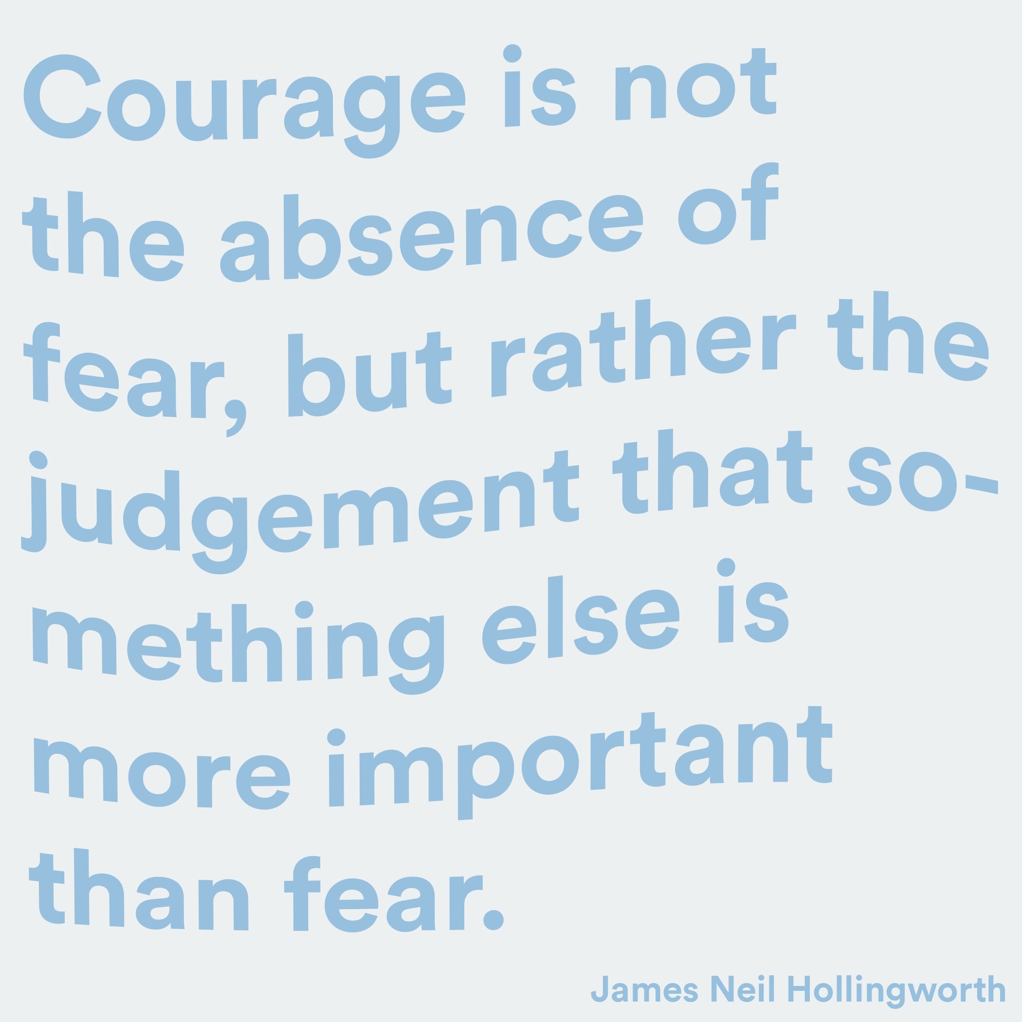
Content Concepts
bold graphics, motivational and concise copy, and shareable assets that are tied back to the Stanford Well-Being brand identity.
all assets illustrated + designed by me