Curology Pamphlet Design
tl;dr
I designed a Curology pamphlet for in-person medical providers. The pamphlet was designed so providers could keep them in their office if they want to refer patients to Curology for acne treatment.
THE PROBLEM
A PA (physician assistant) requested a professional way to refer their patients to Curology. In order to do this, they needed a pamphlet or brochure to give patients and have on display in treatment rooms. Curology didn’t have existing collateral to send over for this request, so something needed to be designed from scratch. Usually, Curology’s creative team handles these requests, but the IMC (brand/integrated marketing) team stepped in to lighten the creative team’s workload.
Task
Create an informational pamphlet that medical providers could have on-hand to refer patients to Curology. The pamphlet should emphasize Curology’s acne-focused products (not anti-aging), and should follow brand guidelines + correct legal verbiage.
I designed the pamphlet from scratch and got the final design approved after mocking up different iterations of the design based off of feedback from Curology’s creative, marketing, medical, and legal departments. After approval, I handled distribution logistics by defining the pamphlet’s dimensions, calculating the cost of printing, and delivering the finished assets to medical providers across the US.
tools + Services
Content Design/UX Writing, Visual Design, Adobe Creative Suite, Copywriting
client
Curology
TIMELINE
1 week
Role
Designer + Copywriter
THE RESULTS
See below for hi-fi mockups and prior iterations of the design. I’ll walk you through my design process and how I incorporated edits based off of feedback from a marketing, creative, medical, and legal perspective. If you’re a real one, scroll all the way to the bottom for a short reflection/what I’d do next time section!
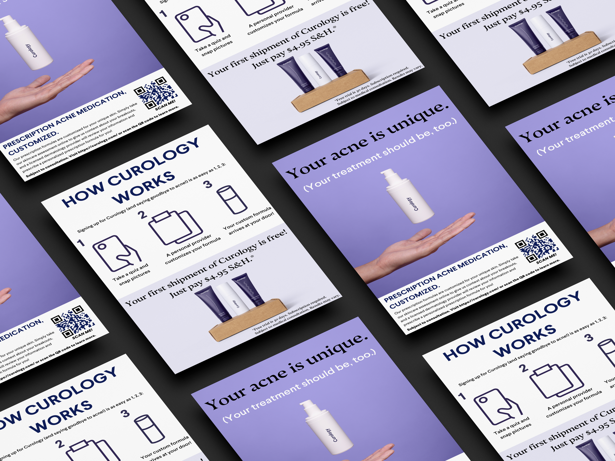
Hi-fi Mockups: The Final Version

Front

Back


My Design Process/Prior Iterations
this design went through a lotttttt of revision (more than what i expected). here’s a breakdown, from concept to final execution:
Ideation/concept phase

I started off with a very low-fi mockup based off of the core facets of the ask for this deliverable. I used Procreate on my iPad to make a rough sketch of what I was thinking of creating + the key info that needed to be on the pamphlet. I decided to do a one-pager rather than a bi-fold or tri-fold pamphlet to keep things minimal and clean. After spending some time finishing the basic “template”, I threw the mockups into Photoshop to include the drop shadow effect.
Iteration #1

This was my first stab at the design. I’ve included some thought processes behind why I included what I did in the design. Of course, this was just my first draft and I would loop in the relevant stakeholders to make sure everything was up to standard. I first circulated this design with my immediate team (the Brand/Integrated Marketing Communications team) for initial feedback before moving on to the IMC team lead for final IMC approval before further sign-offs from the medical + legal teams.
Iteration #2
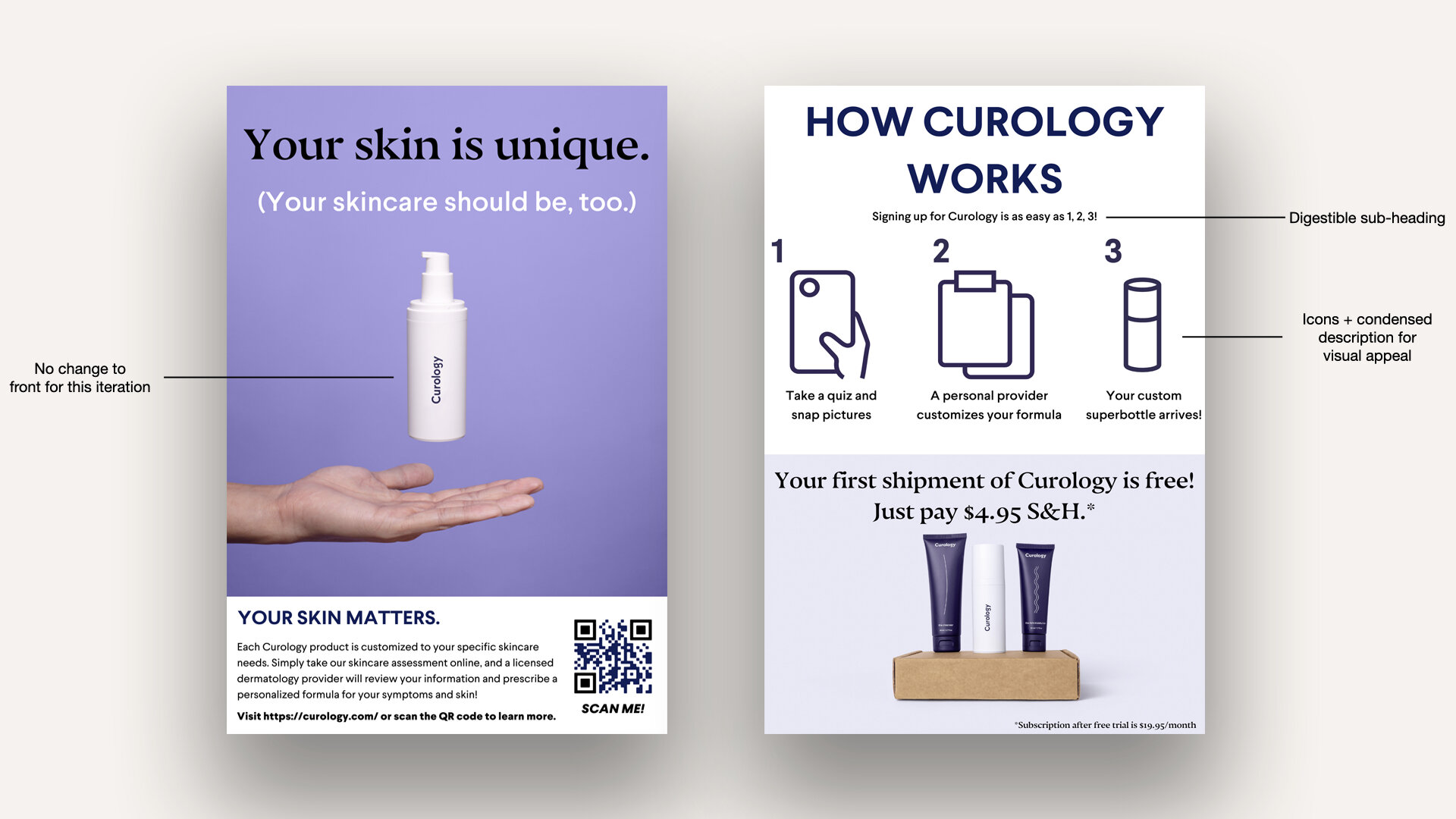
The feedback for my first draft was mainly for the text description on the back. Instead of a paragraph style block of text for the top half, I adapted the block of text to key bullet points and added accompanying brand icons to reinforce the visual style of the pamphlet. I also removed any wording affiliated with anti-aging, as the focus of this pamphlet is specific to acne patients. I sent this draft to the IMC team lead for final IMC feedback and revision before sending it to medical + legal.
Iteration #3

The final feedback from IMC was to change the wording from “superbottle” to “custom formula” in order to align the pamphlet with the brand refresh campaign. I sent this version to the medical team for review.
ITERation #4

The feedback from the first medical stakeholder was to lean into the acne-focus of Curology. Since the pamphlet would be distributed to medical providers referring patients to Curology for acne needs, it was important for the messaging to be clearly about acne. I added the edits based off this feedback, and circulated it to further medical stakeholders for additional review.
ITERATION #5

Secondary feedback from the medical team included changing the headline of the description on the bottom of the front page to say “prescription acne medication, customized”. This was to be more medically clear what the product these patients would be receiving if they subscribed. This was the final revision from the medical stakeholders, so I finally moved it along to legal for final review and approval.
Iteration #6
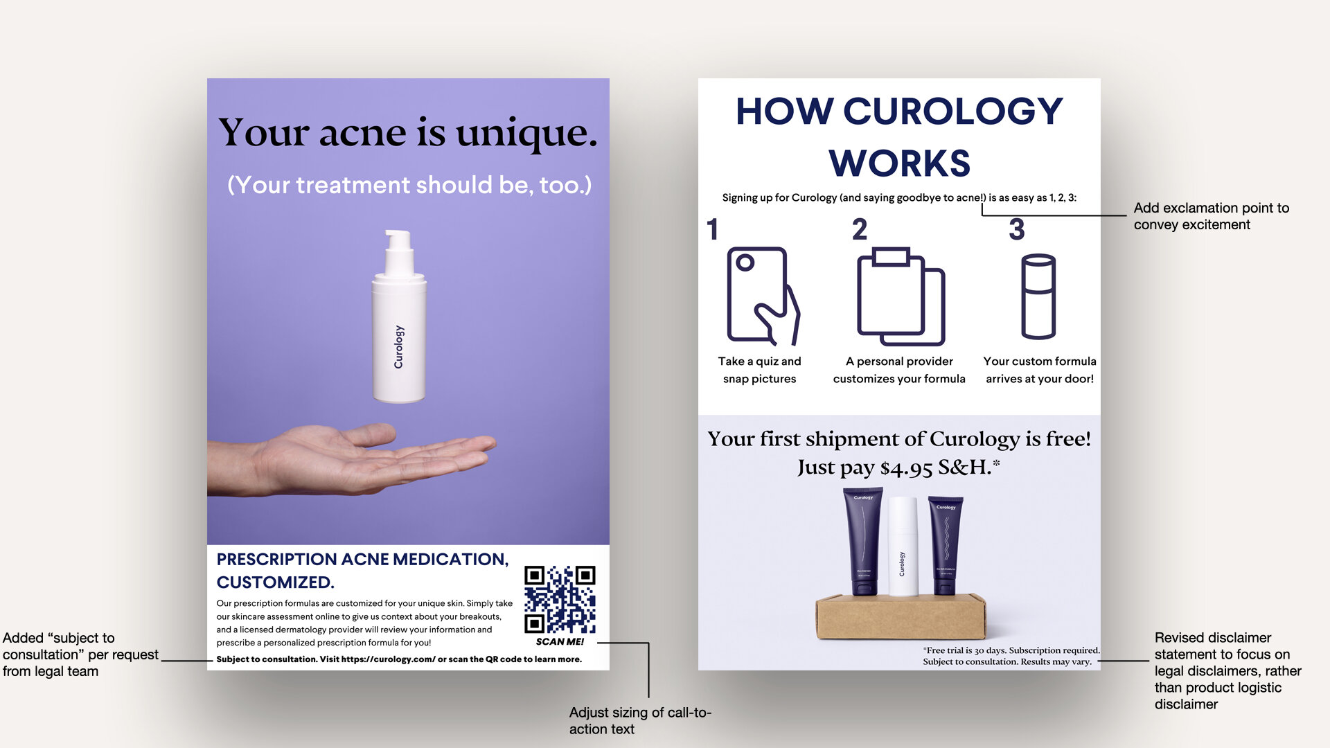
The legal team provided feedback on the pamphlet primarily to advise me how to include the relevant legal disclaimers. After this revision, I looped in all stakeholders for a final revision before official approval and sign-off.
ITERATION #7 (the final one, i promise)

The finishing touches of the pamphlet included integrating a UTM tracker into the QR code on the front page (as a way to monitor traffic to the site via the pamphlet) to measure the effectiveness of the pamphlet and derive insight for future designs. I also made a slight tweak to the disclaimer on the back to include “medical consultation” instead of just “consultation”. This was the final design and is what was distributed to the medical practitioners.
Final thoughts/reflection
Overall, I am content with the lifecycle of how this process played out. I initially thought this would be an easy lift and that I would only go through a few rounds of edits before shipping the final product to the medical practitioners, but there were a lot more stakeholders, and the overall process took a bit longer than I had expected.
If I were to do the process again, I would loop in all the stakeholders at once (ie. create a private Slack channel with all relevant stakeholders) to cut back on the amount of iterations I would have to do, and to shift the process from an individual-heavy task to a more collaborative one, even if I’m the one designing. This project demonstrated how cross-functional the work is at Curology and I will definitely keep this in mind moving forward.